Evolution Of Famous Logos Over Time
1 Instagram

When the Instagram app was released in 2010, the original logo consisted of a Polaroid camera against a white background. The logo was designed by Kevin Systrom, the CEO and founder of Instagram. It featured several buttons, lenses, and a very small “Instagram” on the left-hand side. However, the creators of Instagram quickly realized the camera wasn’t actually related to the app. By the time the app began to gain popularity, the logo had already been changed.

The second Instagram logo design was also inspired by an older version of a camera, this time from the 1950s. The design focused more heavily on the camera lens, centering it and making it the central focus of the art. The logo kept the rainbow stripes, but moved them to the top, left-hand corner of the icon. It also shortened “Instagram” to “INST.” Although this is perhaps the most well-known version of the Instagram logo, it was only in use until 2011.

In 2011, the Instagram logo changed again, but only slightly. The rainbow stripes were widened a bit and “INST” was changed to “Insta,” giving the app its new nickname. More details were also added to both the camera lens and the viewfinder, making them both look more complex and 3-dimensional. This was the design that stuck, and Instagram maintained this logo for five years, until 2016.

In 2016, Instagram redesigned its logo yet again, this time making some drastic changes. Rather than keeping the camera, the logo maintained only the rough sketch of a camera displayed in various bright colors. The new logo was initially met with disdain from viewers, who considered the minimalist look to be too basic. Now, however, the Instagram logo is an accepted version of the app that has become recognizable to viewers across the world. While the design hasn’t changed in five years, it’s certain any future changes will be met with the same skepticism from users of the app.
2 Microsoft
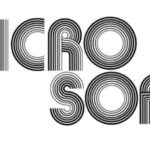
The first Microsoft logo from 1975 looks very different from the logo we know and love today. When Microsoft was first founded in Albuquerque, New Mexico, this is the logo that represented the company. However, it didn’t last very long.
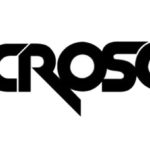
In 1980, Microsoft changed its logo for the first time. Beyond moving the characters from two lines to one, the new logo also featured an adventurous font somewhat reminiscent of heavy metal music. The design change occurred shortly after the company made the move to Washington state.
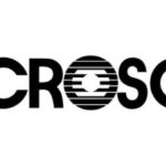
Unsurprisingly, the 1980 Microsoft logo didn’t last very long. The logo was redesigned again in 1982 by Simon Daniels. The team leaned far away from the previous rock star logo by choosing a simple font and a clean design. The “O” was the only standout part of the logo, and it quickly became a beloved part of the design. It was even nicknamed the “Blibbet” by Microsoft employees. However, despite the shift to a more grown-up, conservative design, this logo also wasn’t built to last.
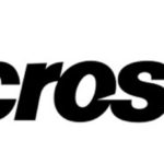
In 1987, five years after the previous change, Microsoft changed its logo yet again. However, this was the change that stuck. The new Microsoft logo was designed by Scott Baker. It was lovingly named the “Pac-Man logo” because of the slash on the “O” that’s vaguely reminiscent of the video game. This logo enduring for 25 years as an assertive, yet still conservative symbol of the company.

In 2012, Microsoft made its final change to the company logo (so far). The change was a big surprise after 25 years, especially since it was a huge departure from Microsoft’s previous logos. The splash of color was an interesting addition, as was the softer font. However, this logo is now the most recognizable emblem for the brand, and Microsoft doesn’t seem to have any plans to change it anytime soon.
3 Baskin Robbins
In 1945, Burt Baskin opened Burton’s Ice Cream Shop in Glendale, California. A couple of years later, Baskin joined forces with his brother-in-law, Irv Robbins, and Baskin Robbins was formed. In 1953, Baskin and Robbins came up with their first joint logo, created by advertising firm Carson-Roberts. The advertising firm also suggest the 31 flavors approach and incorporated the number into the logo.

The Baskin Robbins logo stayed the same until 1991, when it was given a more modern look. The color scheme changed to include blue alongside pink, and 31 become the focal point of the emblem.
The Baskin Robbins logo changed for a final time in 2006. While the 31 remained part of the emblem, it was incorporated into a “B” and a “R,” making the 31 flavors concept a less prominent element of the ice cream shop’s marketing. While Baskin Robbins has introduced hundreds of flavors since it was first opened, the newest logo still remains true to its roots.
4 Burger King

Burger King was first opened in 1953 in Jacksonville, Florida. At the time, it was called Insta Burger King. The original logo for the restaurant simply featured the name “Burger King” with what looks like a rising or setting sun above it.
In 1954, Burger King was sold to David Edgerton and James McLamore. The sale came after the original owners faced financial difficulties. The new owners lost the “Insta” and renamed their new restaurant simply “Burger King”. They also changed the logo, going with just the name of the restaurant in a unique font.

In 1957, Burger King got new owners once again. They decided to change the restaurant’s logo, this time going with a much more complex design. Created to emphasize the meaning of the restaurant’s name, the next logo featured an animated king sitting atop a burger. The new logo also included, “Home of the Whopper,” as an advertising ploy to draw in more customers.

Twelve years later, in 1969, Burger King decided to change its logo once again. This time, they went with an entirely new design featuring the restaurant’s name set between two burger buns. This set the stage for Burger King’s ultra-recognizable logo, which has featured spin-offs of this design since it first debuted in 1969.

The Burger King logo stayed the same until 1994, when it faced minor changes. The new logo featured new text that wasn’t quite as bold and cartoonish as the original. In addition, the bun was made slightly fluffier, especially at the top.
Just five years later, Burger King faced another logo change. The 1999 logo is perhaps the most well-known, especially for the younger generation. Although it resembles the previous versions of the logo, it features brighter, more eye-catching colors and a blue, C-shaped crescent on the left-hand side. Designed by Sterling Brands, the logo is also diagonally positioned with the Burger King text slightly larger than the burger bun it sits in.

The Burger King logo remained unchanged for 22 years. Then, in 2021, Burger King came out with a new, simplified design. The new logo, part of a rebrand for the franchise, returns almost exactly to the 1969 design. Spokespeople for the company said they were excited to pay homage to the brand’s heritage. The rebrand comes with new uniforms for the staff and revamped marketing assets.
5 Apple
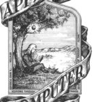
While the Apple logo today is simple and recognizable, it went through a few transformations before it reached that point. The original Apple logo when the company was started in 1976 looked nothing like it does today. It featured a plaque surrounded by a banner that reads Apple Computer Co. The plaque depicted the story of Isaac Newton discovering gravity when an apple fell on his head. However, Steve Jobs didn’t like this original logo and claimed it lacked clarity, so it was soon changed.
Steve Jobs hired Rob Janoff to design his next logo. He requested something more artistic, and Janoff came up with a rainbow apple that had a bite taken out of the side. This logo remained the main branding for Apple for over two decades, from 1976 to 1998. Although the Apple logo began to change in 1998, all further iterations maintained Janoff’s basic imagery and design.
In 1998, the Apple logo changed again. The change came soon after Steve Jobs rejoined the company in 1997 after a 12-year absence. Rather than the rainbow Apple, the new Apple logo featured a monochrome apple that better aligned with the new metallic casing used on Apple computers. Since 1998, Apple has maintained its basic, monochrome logo. Today, the logo comes in three colors: white, black, and silver. It doesn’t seem there are any plans to change the logo again anytime soon.
6 Walmart

When Walmart first opened in 1962, it didn’t have an official logo. Instead, the “logo” was just the name of the store, without any distinguishing characteristics. Oftentimes, the way the name was printed changed based on the style of the printer. However, Walmart soon realized the importance of their company’s branding.

In 1964, Walmart came up with its first official logo. They chose a frontier font that gave the store an Old West feel. They also added in the hyphen to align with the official name of the company, Wal-mart.

In 1968, Walmart added to its official logo by providing more information about the company. They honed in on the low prices and discounts available at the store, transforming the logo into more of a sticker rather than just the Walmart name. That logo stuck around for years and helped to establish Walmart as the one-stop shop for all budget-conscious consumers.

In 1981, Walmart decided to make more changes to its logo. They ditched the excess information and the frontier font, which was still used for exterior building signage, and replaced it with bold, block letters. The simple logo had almost no distinguishing characteristics, but ushered in a new era for the company.

The simplified Walmart logo lasted 11 years, until 1992. At that time, the logo was changed again, and the hyphen was replaced with Walmart’s signature star. The company also embraced blue as a thematic color, though the rest of the logo was still kept fairly simple.

In 2008, the Walmart logo underwent another change, this time of a more drastic nature. Rather than block letters, the new logo embraced a slimmer font and did away with the capitalized letters. The logo also traded out the star, making Walmart one word. Lastly, the logo added Walmart’s golden emblem, which is somewhat reminiscent of a sun. The color and design made the company feel fresh and young, which is exactly what they were shooting for at that time.
7 Nike
Although the Nike swoosh is iconic, it was not the first logo the company used. Nike co-founder Phil Knight first opened up a business he named Blue Ribbon Sports. Blue Ribbon Sports sold Tiger shoes, a Japanese brand.

In 1971, Phil Knight decided to launch his own brand of shoes. He asked Carolyn Davidson, a graphic design student, to make a logo for him. Carolyn submitted her initial design, the one seen above, and went down in history for creating one of the most famous logos to ever exist.
While the swoosh has remained a crucial part of the Nike logo design, the company experimented with variations on its logo throughout the years. In 1971, Nike replaced Carolyn’s original cursive writing with a geometric-type font. The company also moved “Nike” and placed it above the swoosh.
In 1985, Nike made a small change to its logo. They kept the design from 1971, but made the company name and the swoosh white and placed it inside a black square. However, that logo didn’t last very long.
In 1995, Nike simplified its logo again, this time relying solely on its iconic swoosh. The swoosh is synonymous with the company and is widely considered one of the world’s most recognizable logos.
8 Adidas

Founded in Germany by Adolf Dassler in 1949, Adidas’ original logo focused heavily on the roots of the company. The center of the logo featured a shoe between two American football posts. Around that image, Dassler put his own name, the name of his company, and the focus of his products. While it certainly got the message across, it was a bit too complicated to have a truly long life.

Just a year after Adidas was founded, the logo changed. This time, the company decided to drastically simplify its branding. Adidas removed the graphic element completely and simply put the name of the company in white block text inside of a black box.

The second logo lasted much longer than the first, but it was changed again in 1967. While the company kept the same font for their new logo, they removed the black box and made the text itself black, further simplifying the design.

In 1971, Adidas decided to rebrand and create another new logo. The new logo re-introduced a graphic element, as well as the three lines Adidas is known for in its branding. In order to use the three lines without backlash, Adidas brought the Finnish brand Karhu, which used a similar three-stripe design in its logo. The new design placed the old 1967 logo beneath a cloverleaf, which was meant to represent North and South America, Europe and Africa, and all the countries of Asia.

In 1991, Adidas changed its logo again. This time, the cloverleaf was replaced by three diagonal lines. The lines were made to look like a mountain, aligning with the idea of overcoming obstacles. While some felt this logo was too simple, it’s still an essential part of Adidas’ brand identity even today.

In 2002, Adidas changed its logo again to herald a new era for the brand that aligned with the start of the millennia. This logo look similar to claws, and some feel the logo was trying to evoke images of a powerful animal when consumers looked at Adidas products.

In 2005, the company decided to simplify its logo, putting three black and white stripes next to Adidas’ name. This logo is another that has endured for years and has become a signature element of the brand.
9 Target

The first Target store opened in 1962 in Roseville, Minnesota. Touted as a discount store, the owners finally chose the name “Target” after exploring over 200 other options. The first logo was the most complex in the brand’s history, which is why it was changed fairly quickly.

In 1968, Target introduced the emblem that still represents the brand today. Rather than three red circles, this emblem reduces the red circles to two and gets rid of the Target writing over the top of the logo. Legibility was increased, and the emblem soon came to represent the entire store.

In 1974, Target re-added the name of the company to the logo. But rather than the italicized type they used before, they shifted direction and used solid black block letters.

In 2004, Target shifted its logo strategy again. Since the emblem was so recognizable, the creators deepened the color of the red they used and moved the company name beneath the symbol, also using red lettering rather than black.

In 2018, Target made a simple modification to its logo. Rather than capital, block letters, the logo now put the name of the company in lowercase letters. The simple change was barely noticed; however, as most people have only paid attention to the symbol since Target’s inception.
10 Shell

Oil and gas company Shell has always used a graphic shell as its logo, ever since the beginning of the brand in 1900. However, the actual shell used has changed drastically over time. The very first shell, released in 1900, featured a monochrome drawing that only vaguely looked like a shell.

In 1904, Shell released a more confident shell design. This shell included more detail and was drawn vertically. To make the image pop, the shell was placed over a black background.

In 1909, Shell got rid of the black background and added more colors and contouring to the shell design. Still, they didn’t bother putting the name of the actual company. The shell seemed like enough to represent the business.

In 1930, Shell moved towards a more modern version of its original design. The new shell had a more animated look than previous versions and certainly looked much sleeker than the 1909 design.

In 1948, Shell finally added its red and yellow color palette to the shell logo. At this time, white letters reading “Shell” were also placed over the design, adding the name of the company to the logo for the first time ever.

In 1955, Shell simplified its logo, getting rid of some of the contours of the shell and changing the lettering to red.

In 1961, Shell altered its logo by placing the shell design of 1955 over a red background.

In 1971, Shell made a more drastic change to its design. The red box was reduced to a simple red border surrounding the shell, and the shape of the shell itself was altered. While it still looked somewhat like a shell, it also seemed to look like a rising sun. The name of the company was also placed below the emblem rather than on top of it.

In 1995, Shell made another minor change to its logo. The red and yellow colors became a bit more muted and the Shell lettering boasted a more rounded look, rather than the square letters of the 1971 design. Other than that, the logo stayed exactly the same.
11 Volkswagen

Interestingly, Volkswagen was originally Adolf Hitler’s idea. He wanted to build vehicles for the people that were more affordable than what was currently available at the time. Volkswagen’s first work was for the Nazis in 1934. The first logo was released in 1937. It featured a V and a W inside a frame that was made to look like the wheel of a car. However, the symbol also looks similar to the Nazi swastika.

In 1939, Volkswagen released a new symbol that no longer included the swastika-like elements. The letters became bigger and bolder, and the essential element of the wheel remained.
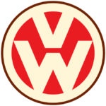
In 1945, Volkswagen changed its logo again, this time adding a bit of color into the mix. While it kept the circular design, it used a cream and red color palette to give the logo more of a graphic element.

In 1960, Volkswagen reverted to an all-black logo. The essential elements remained the same—the V and the W inside a circle—though this time the brand added a black box around the outside of the logo.
In 1967, Volkswagen did away with the square, though it kept the circular design inside the square from 1960. This time, it also changed the colors to blue and white, rather than black and white.

In 1978, Volkswagen made a small change to its logo. They added an extra blue circle around the outside and made the inside of the circle blue with white lettering. The blue also took on a deeper color than the previous logo in 1967.

It seems Volkswagen had a bit of trouble deciding on the ideal color for its logo. In 1989, it changed the color of the blue again, this time going with a light, vibrant hue. The essential elements of the design remained the same, though the proportions did change slightly.

In 2000, Volkswagen decided to give its logo a big upgrade. They made a three-dimensional version of their former logo, changing the colors slightly and ushering the brand into the modern era.

In 2012, Volkswagen leaned into their modern logo, making the 3D elements more defined and sharpening up the lines of the emblem. It was nearly the same as the 2000 logo, though it seemed to have a little more power behind it.

In 2019, Volkswagen decided to go back to its roots by simplifying the logo once again. The new logo was specifically designed to look futuristic, as it was meant to celebrate the company’s launch of electric cars. However, the emblem actually harks back to the brand’s previous design by re-instating the circle with a V and a W in the middle, though this logo features a much darker color than the company used before.
12 Starbucks
The twin-tailed siren is the main figure in Starbucks’ logo, and it has been since the coffee shop released its first logo in 1971. At that time, however, the logo featured a much more explicit version of the siren. The siren was drawn with plenty of complex detail, and it was set inside Starbucks’ signature circular badge with white lettering along the outside of the circle.
In 1987, Starbucks leaned into its signature green color for the first time. The badge became more modern, and the siren was made more monochrome and cartoon-ish, which was a big departure from the lifelike siren of the 1971 logo.
In 1992, Starbucks made more changes to its logo, zooming in on the siren to make her face more prominent. This logo remained in place until 2001 and is likely one of the more recognizable versions of the company’s emblem.
In 2011, Starbucks redesigned its logo again. By this time, the siren had become such an iconic piece of the logo that the brand decided to remove all the words around it and stick with the siren alone to represent the company. The siren stayed white, but the area behind her became green. The new logo represented a modern, simplistic new look for the company.
13 FedEx

US delivery services company FedEx has only made a few changes to its logo over the years. The first logo appeared in 1973 and used the company’s original name, Federal Express. The founder of FedEx, Fred Smith, thought “federal” gave the company some level of importance that might encourage customers to use it. The purple and deep red color scheme was a fairly big difference from later iterations of the logo.
In 1991, Federal Express changed its name to FedEx. The update also demanded a change to the logo. Rather than diagonal letters, the new logo sat horizontally, though it used the same rounded lettering as the previous logo. The colors also changed slightly, with the purple growing deeper and the red lightening to more of an orange color.
In 1994, FedEx embraced the logo it still uses today. The purple and orange color scheme was put in place, along with the block letters. Most importantly, this logo incorporated the white arrow between the “E” and the “X.” The logo was designed by Lindon Leader, who had a penchant for minimalist designs.
14 Disney
The first Disney logo was released in 1929 and featured Walt Disney’s iconic character, Mickey Mouse. Alongside an image of a waving Mickey was a range of words that clutter the design. Still, the logo remained in place until 1937, when Walt Disney simplified the emblem.

In 1937, Walt Disney released a new logo that featured his name in a creative, handwriting-looking script. The artistic design remained the symbol of the company for another 11 years.
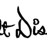
In 1948, Walt Disney changed the font of the logo, choosing a swirling, slightly less legible design.

Years later, in 1972, Disney changed its logo again, finally using the lettering and font that is still employed today. The word “Productions” was also added to the bottom of the logo, though it appeared in a simpler font.

In 1983, Disney changed “Productions” to “Pictures,” but kept all other elements of the logo the same.

In 1985, Disney first employed Cinderella’s castle as the image associated with its logo. The simple castle was placed above what was almost an exact copy of the 1983 logo, though “Pictures” was made slightly larger.

The 2006 logo featured a much more refined version of Cinderella’s castle. Though the castle was still a 2D image, the added detail gave it a refined look. The circle over the top of the castle was also made into a shooting star, and “Walt Disney Pictures” became smaller, allowing the castle to take center stage.

In 2011, Disney simplified its logo, removing both “Walt” and “Pictures” and allowing “Disney” to shine. The same castle from the 2006 logo was still used and eventually became the inspiration for the Disney Castle in Paris.
15 Pampers

The original Pampers logo looked nothing like the modern logo of today. With black type set against a red background, the logo has a dated look appropriate for 1961, which is when it was released.

The Pampers logo didn’t change until 1985, when the company embraced a significantly more modern look. The letters became round and bubble-like, creating a friendlier, more approachable look.

In 2001, Pampers simplified the lettering of its logo and added a yellow heart at the top. The heart was made to resemble a rising sun, adding a playful, warm look to the overall design.

In 2011, Pampers changed the color scheme of its logo, embracing a green-ish blue rather than the deep blue of previous versions. The heart was also simplified and the extra yellow lines were eliminated, lending to a more modern look for the company.
16 Canon
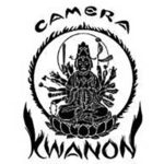
Japanese company Canon leaned into its heritage with its first logo. The logo, released in 1934, featured a Buddhist god in the middle of a circular badge surrounded by bold letters in an artistic font that almost resembled rising flames.
Just a year later, in 1935, Canon drastically simplified its logo. This time, the logo only featured the company’s name in a thin, unassuming font.
The Canon logo wasn’t changed again until 1953. Even then, the company only updated the font of the logo, embracing darker, bolder letters.

In 1956, Canon made its final change to its logo. It changed the color scheme to red and white and added more artistic elements to the letters. The logo has remained the same for 65 years, and Canon doesn’t seem to have any plans to change it anytime soon.
17 Snapchat

Although Snapchat was first created in 2011, it has still gone through a few changes to its logo design. Snapchat’s founder created the logo in his home, coming up with the ghostly figure in one night. The first Snapchat ghost featured a cute face, complete with a pink tongue sticking out of its mouth.

In 2013, Snapchat released a redesigned logo that eliminated the face of the ghost. The company claimed they wanted the ghost to represent the diverse Snapchat community, rather than just a smiling face.

In 2019, Snapchat made a slight change to its logo, deepening the black lines outlining the ghost. Other than that, the logo remained the same.
18 Amazon

In 1995, the first Amazon logo, designed by Turner Duckworth, was released. The logo was made to look like the Amazon river, an apt symbol for the company.

In 1997, the original Amazon logo was made slightly more detailed. White diagonal lines were added to the black background, making the logo look something like a zebra. The added details obscured the river a bit, though the basic imagery was still clear.

In 1998, Amazon made big changes to its logo. In fact, two separate logos were all released in that same year. The first called Amazon “Earth’s Biggest Bookstore” and featured a black-and-white theme.

By the end of 1998, Amazon changed its logo again. This time, the logo added an orange swish underneath amazon.com. The arch of the swish was meant to represent a bridge connecting the past and the future. This was Amazon’s simplest logo, but it stayed in place for just over a year.

In 2000, Amazon released the logo it still uses today. The orange swish was changed into an arrow, though it also resembles a smile. Amazon has used iterations of this logo for over 20 years and it has easily become a recognizable element of the brand.
19 Twitter

The first Twitter logo looked nothing like the logo of today. Featuring two shades of green, the logo didn’t even state the company’s full name, instead using “twttr.” It was also barely legible, which is likely why the company’s founders soon decided to change it.
In 2006, Twitter released its first logo in its signature blue. The logo, written in lowercase bubble letters, was designed by Linda Gavin.
In 2010, Twitter used the same logo from 2006, but added a bird to the end of it, creating Twitter’s new signature emblem.

In 2012, the cartoonish bird had become synonymous with Twitter. The new logo featured the bird alone, with cleaner lines and no tuft of feathers on its head. The blue of the logo was also darkened a bit. The company announced at the time that they had no plans to change the logo for a while.
20 Dell

Dell was first called PC’s Limited, and the first logo, released in 1984, featured that name. The logo was simple enough, featuring a bold, black font alongside a geometric emblem.

In 1987, the company’s name was changed to Dell, which meant the logo had to change as well. The letters, though still black, were made less bold and blue lines were introduced along the top and bottom of the company’s name.

In 1989, Dell embraced the blue in the previous logo as the main color of the new logo. Using bold, blue letters, the new design turned the “E” of Dell on an angle.

In 2010, Dell used the 1989 logo, but made a few changes. They placed Dell inside a blue circle, creating more of a badge rather than just a word.

In 2016, Dell made minor changes to its logo to celebrate the company’s merger with EMC, mainly thinning out the letters of Dell and the surrounding blue circle. The main elements of the logo remained the same, however, leaning into the company’s desire to be a reliable source of emerging technology.
