Awkward Magazine Covers People Regret Ever Doing
1 Harper’s Bazaar China: Sarah Jessica Parker’s Photoshop Fail

Sarah Jessica Parker’s name goes hand-in-hand with fashion, thanks to her role as the stylish Carrie Bradshaw on the hit show Sex and the City. While we’ve seen her on the cover of many magazines, she looked a bit off on the March 2013 cover of Harper’s Bazaar China.
They Photoshopped her face so much that the actress was barely recognizable. From her crazy smooth complexion to the intensity of her blue eyes, there’s no way a person could like that without poorly executed retouching. Poor thing doesn’t even look human. We’re not sure who they thought they were fooling.
2 People: Betty White’s 100th Birthday Cover

Fans fell in love with Betty White from her time on the show Golden Girls and in movies like The Proposal. In honor of the actress turning 100 years old, People magazine ran a cover story celebrating her life in January 2022. In a heartbreaking turn of events, White passed away on December 31, 2021, just 17 days shy of her 100th birthday.
While fans mourned the loss, one awkward situation popped up. People‘s cover story had already hit the newsstands. While it may have seemed like poor timing, it was actually comforting to see her smiling face after her death.
3 Time: Virtual Reality

Palmer Luckey, the inventor of the virtual reality headset Oculus Rif, appeared on the August 2015 cover of Time magazine. At the time, VR was a new technology and while it was exciting to have Luckey featured, the cover was roasted big time by readers.
For starters, he was shown leaping in the air with no shoes on, in an almost childlike way. Then, people were outraged by the unrealistic beach seen behind him. Social media blew up with pictures of him Photoshopped in front of various scenes. Unfortunately for Time, the whole thing was a huge flop.
4 Runner’s World: Stretching Out
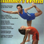
We take a look back at vintage magazine covers to find this gem. Runner’s World magazine features stories geared toward health nuts and this cover from February 1981 was focused on stretching exercises for the groin, hence the awkward pic of people stretching.
This photo is a celebration of all that was hip in the athletic fashion world in the 80s. From the stripes down the side of the running shorts or the baby blue New Balance shoes, this was such a popular style then. We’re so glad that a magazine cover like this exists because it’s like a weird time capsule.
5 Hello!: The Emo Duke Of Cambridge
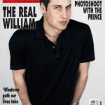
Prince William landed the February 22, 2010 cover of Hello! magazine to the amusement of everyone. The Duke of Cambridge appeared to look a bit different than he normally did in this now-famous photo. It wasn’t just his casual attire that caught everyone’s attention.
Someone in the styling department decided that he’d look better with a head full of black hair instead of his signature thinning blonde hair. It was such a stark contrast that the cover became the butt of many jokes. Which is sad, because he looked really cute with dark hair. Maybe he should consider making the change.
6 Marie Claire: Alien Eva Mendes

We can’t help but wonder what the folks over at Marie Claire were thinking when they edited this photograph of Eva Mendes for their March 2021 cover. We don’t mind that it looks like they stuffed her into a bustier with candy glued on it.
We do take issue with the fact that they totally morphed her right arm and messed up her face with Photoshop. This woman is so stunning, why did they even think they needed to retouch her photos? She looks like an extremely glamorous other-worldly being. This is just another example of how the media distorts natural beauty.
7 Time: Prince Harry And Meghan Markel Airbrush Fiasco
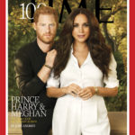
Prince Harry and Meghan Markle graced the cover of Time magazine’s “100 Most Influential People” on October 4, 2021. Markle wore a white power suit while Prince Harry went for an all-black look. It wasn’t their fashion choices that got everyone talking, though.
Social medias lit up with comments roasting the cover because their faces were so heavily airbrushed. Many people thought that the image looked like CGI. Other readers commented that it looked like Markle wore the pants in the relationship because of the way Harry hid behind her. Regardless, this cover is pretty much as awkward as they come.
8 InStyle: The Missing Wrist

There’s no denying that Carrie Underwood is a talented artist and a beautiful woman. She must have been so excited when she was offered the chance to be on the cover of InStyle magazine. The December 2010 issue featured the lovely singer in a glam dress.
There was just one problem. In yet another Photoshop fail, editors somehow made her right wrist disappear altogether. She’d have to be a contortionist for her arm to be able to bend in such an unnatural way. She must have been so embarrassed to appear disfigured on the cover of a magazine that covers Hollywood style.
9 W: Demi Moore’s Photoshop Nightmare

Demi Moore starred in huge hits in the 1990s like G.I. Jane and Indecent Proposal. While her acting career has taken a backseat to family, the actress still pops up at red carpet events and magazine covers now and again.
She somehow seems to defy age and looks more beautiful the older she gets. However, her 2009 cover for W magazine had readers scratching their heads. It appeared like her left hip had been Photoshopped. Moore took to Twitter to defend the photo, claiming it wasn’t retouched. Yet, it’s pretty obvious it was smudged a bit.
10 Sassy: Not So Sassy

Sassy magazine was made for Gen X teen girls in the 90s and was known for being cutting edge when it came to fighting beauty standards. So, it’s no shock that they would feature a total nerd on their cover along with the headline “Our beginner’s guide to makeup.”
We don’t mean to be mean, but this girl with huge glasses and braces was a far cry from your typical cover girl. Not to mention her red tuxedo jacket and bow tie. This has got to be a joke because it’s just too funny to be a real magazine cover.
11 Elle: The Flamingo

Kylie Minogue is a gorgeous Australian singer and actress. She’s always on the cutting edge of fashion, so it’s no wonder that Elle magazine featured her on the cover of their January 2013 edition. They showed a photo of her standing in a chic mini dress and spiked high heels.
The usually flawless beauty was yet another victim of bad Photoshop when they cut out part of her left leg. The poor thing ended up looking like an awkward flamingo. Where did the back of her leg go? It’s a mystery and we may never know the answer.
12 Ebony: A Bit Overdressed

Mariah Carey and Nick Cannon posed for the January 2014 cover of Ebony magazine. They were called out for being totally out of touch and posing in a swimming pool in evening wear. Carey plunged into the water wearing a red gown with black heels, while Canon wore a suit.
The whole thing looked forced and slightly absurd. Of course, the irony is not lost that the headline talks about secrets to making your love last, and these two divorced only 2 years after the magazine was published. This cover just did not age well at all.
13 Rolling Stone: Historical Mistake

Julia Louis-Dreyfus played Vice President Selina Meyer on the series Veep for 7 seasons. So, it made sense that she’d pose nude on the cover of Rolling Stone magazine in 2014 with a fake tattoo of the American constitution printed on her back. What seemed like a clever idea ended up being an epic failure.
The actress was called out because John Hancock’s signature appeared on the lower left side of her back. This caught the attention of history buffs because John Hancock signed The Declaration of Independence, not the Constitution. Who says the historical accuracy is important, anyway? Sheesh!
14 Joy: Taylor’s Unrecognizable Face
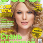
Taylor Swift is a superstar who little girls look up to. She’s won 11 Grammys and has recorded huge hits like “Shake It Off” and “Bad Blood”. The singer has graced the cover of many magazines, but this one takes the cake.
Swift was featured on the front of a Russian magazine and looked more like a victim of bad Photoshop than the icon she is. They airbrushed her face to the point that you can barely tell that it’s her at all. No one has skin that smooth in reality. That photograph couldn’t even pass for a Taylor Swift lookalike.
15 Vogue: The Longest Arm

At first glance, this March 2017 cover of Vogue looks like a celebration of diversity, showing models of various ethnicities and shapes. The cover featured Liu Wen, Ashley Graham, Kendall Jenner, Gigi Hadid, Imaan Hammam, Adwoa Aboah, and Vittoria Ceretti standing in a huddle. Yet, a closer look reveals that the magazine pulled some Photoshop shenanigans.
The publication was blasted for editing Gigi Hadid’s arm to extend it to cover plus-size model Ashley Graham’s waste. While Vogue never confirmed or denied the accusations, Hadid would have to have a freakishly long arm for them to have not touched up the photograph.
16 Filmfare: Born Again

This next item on this list is pregnant with possibilities. The April 1988 cover of Filmfare was a bit of a head-scratcher. It featured Bollywood star Shah Rukh Khan posing as a pregnant man, and by the looks of his bump, he was about to pop.
Who came up with this concept? We get that it goes with the headline “Born Again” that appeared on the cover, but it’s a bit strange. Oh well, in this day and age, anything goes. Who are we to judge? More power to you, Mr. Kahn. This cover was ahead of its time in the 1980s.
17 Parents: Unfortunate Photo Placement

Parents magazine is a reputable publication that gives moms and dads parenting advice. That makes this unfortunate cover from April 2005 even funnier. Thanks to the placement of the woman’s noggin, the masthead was transformed from “Parents” to a certain part of the male anatomy.
This is a case where the cover editor had a bit of explaining to do. We’d love to be a fly on the wall during that meeting. They literally had one job and totally failed at it. Thank God they did, because now we have this hilarious magazine cover to immortalize in all its glory.
18 Der Spiegel: Death To The Queen!

What was supposed to be an ode to Queen Elizabeth II comes off as more of a death wish on the front cover of German print magazine Der Spiegel‘s August 2016 issue. At least it would appear that way to English speakers. But, anyone who knows German knows that the word “die” simply means “the.”
One has to wonder why they mixed up the two languages, though. They use German for the word “the” and English for the word “queen.” Had they written it entirely in German, it would have read “Die Königin.” I guess no one bothered to proofread it before it was printed.
19 Where: Poorly Placed Photo

Where? That’s what someone who works at this magazine should have asked when it came to the placement of this poor, unsuspecting young lady’s photo. Putting her picture in this exact location changes everyone’s perception of the front cover altogether—including how we view the model.
And get this: This isn’t the first time this has happened with Where magazine. Its January 2012 issue, for example, had a photo of a different young lady in the same location on the front cover. All I know is that if I were a model, I’d think twice before posing for this magazine.
20 Tails: A New Take On Family Dining

According to the October 2010 issue of Tails magazine, renowned chef Rachael Ray has taken the phrase “family dining” to a whole new level. On the front cover are the words “Rachael Ray finds inspiration in cooking her family and her dog.”
Now, let’s try that again, but this time using commas. Here we go: Rachael Ray finds inspiration in cooking, her family, and her dog. See how that sentence flows so much better and isn’t nearly as disturbing as the first one? This just goes to show the importance of punctuation. And that, boys and girls, concludes our English lesson for the day!
21 Vanity Fair: The Three-Legged Woman

Ah, the magic of Photoshop. It lets you easily remove unwanted spots, objects, and people from your photos. It also lets you easily add spots, objects, and people to your photos. Unfortunately, after editors have added and removed all the people and objects they’ve wanted, they sometimes forget to put things back as they should be.
Case in point: Vanity Fair‘s 2018 Hollywood Portfolio issue showcases some of Hollywood’s leading stars on its front cover. And, at first glance, you might not even notice what’s wrong with the picture. But if you look closely at Reese Witherspoon, you’ll see that she has three legs instead of two.
Twitter user @leiascaptain was quick to notice it, and tweeted the following: “im tryna figure out how many legs reese witherspoon’s got in here, it’s been bothering me for the last five minutes.” [sic] To which Reese Witherspoon responded: “Well…I guess everybody knows now…I have 3 legs. I hope you can still accept me for who I am. 😃 (and I will never apologize for snuggling @Oprah .. if you get the opportunity, I highly recommend it;).”
22 ¡Hola!: Need A Hand?

Okay, I just have one question: Whose hand is that holding onto the waist of the lady on the right? Or maybe it’s her own hand and she just has a really long arm. My guess is that’s what it’s supposed to be—her own hand touching her waist.
I know I said I had only one question, but now I have another one: Who was in charge of editing? Why didn’t they fix this? And did they really think we wouldn’t notice? Okay, that was more than one question, but that fact still remains that someone goofed on this one.
23 CineBlitz: Two Heads Are Better Than One

Is that a two-headed woman?? No, it’s actually two actresses sharing the same sweater. For what reason I don’t know. I certainly wouldn’t want to share clothing with someone else while I’m still wearing it. But, I digress.
Anyway, needless to say, the photoshoot was a bit controversial. According to an article published by Asianet News, “the photoshoot was conducted in 1996 and irked many people.”
Still, the models, Kajol and Rekha, said it was a fun photoshoot, according to Asianet News. Additionally, years later, after the photoshoot, the two met up and “they mocked its idea and took it very lightly.”
24 TIME: There Can Only Be One

“There Can Only Be One” was the headline that accompanied what some would call one of the weirdest TIME magazine covers ever. This May 2008 issue of TIME features a split black-and-white photo of Barack Obama and Hillary Clinton. Of course, you know, this was during election year, and obviously there could only be one winner for the Democratic nomination.
But what was the purpose of making this creepy mockup? It almost looks like someone who suffered a stroke. And that’s no offense to stroke victims, because we all know how serious a stroke can be. I’m just saying that’s what it kinda looks like.
25 This Is Harrison County: Butt Drugs

The above image graced the cover of Harrison County, Indiana’s Chamber of Commerce magazine, in 2012. And to a resident of Harrison County, there’s absolutely nothing wrong with this cover. But to outsiders, well, it conjures up certain images we don’t want to mention here.
So, what’s the deal with this cover, anyway? Glad you asked. It’s actually an advertisement for a local pharmacy named Butt Drugs. And yes, “Butt” is the last name of the guy who founded the pharmacy. According to its website, it’s “a third generation family pharmacy established in 1952 by the late William (Blackie) Butt, R.Ph.” The pharmacy sells cheeky apparel and serves up ice cream, soda from an old-fashioned soda fountain, and their famous butt shakes!
26 Mega: Slender Woman?

Okay, what’s going on with Katrina Halili’s right hand? More specifically, the fingers on her right hand. Someone online said that that hand looks like it belongs to Slender Man. Ironically, Slender Man made his first appearance as a Creepypasta internet meme in 2009 and this cover was for Mega magazine’s August 2009 issue. Hmm…
But this just goes to show you how easy it is to get carried away with Photoshop. I mean, obviously, that hand doesn’t belong to her. I’m not even sure it’s a real hand at all. The more I stare at it, the more creeped out I become. Anyway, let’s just hope that Mega learned from this mistake.
27 Doll Reader: Chucky’s Next Bride

The cover of this May 1998 issue of Doll Reader has got to be one of the creepiest things I’ve ever seen. The feature story is about fitness guru Richard Simmons and his personal collection of dolls, as well as his line of dolls for L.L. Knickerbocker.
Instead, it should be about a creepy lifelike doll that’s possessed by the soul of a serial slasher. Oh, wait… that’s the storyline of Child’s Play! Still, this doll, who goes by the name Webbie Debbie, fits right in with that movie. Perhaps she can be Chucky’s next bride.
TIP
DO NOT search for pics of Webbie Debbie online. Trust me, you’ll be sorry you did!
28 Lucky: The Unflattering Wig

This is indeed one magazine cover that was a major regret. In fact, Lucky issued an apology to its readers after facing backlash for publishing a photo of Britney Spears that one Twitter user described as “truly heinous.”
Here are some more tweets from other unhappy Britney Spears fans:
“Who put that wig too low on Britney’s head?” —@iBraglots
“Who let this happen? Brit is in a crooked hair hat, not a wig.” —@Piaglenn
And here’s the apology from the magazine for the photo that appeared on its December 2012 front cover: “Thank you all for sharing your thoughts on our cover! As always, we will share with our team and we’re sorry to have let some of you down.”
29 The Word: E.T. Phone Home

I know some people have long fingers, but this looks like something straight out of E.T. the Extra-Terrestrial. Ironically, in an attempt to make this photo look more natural, the magazine actually made it look unnatural. I mean, seriously, who has fingers that long? I don’t even think Shaquille O’Neal has fingers that long—although I could be wrong, haha!
Just for kicks, I decided to see if I could find other photos of this guy online, and what do you know, I did. And you know what else? His fingers aren’t nearly as long as the magazine cover would have you believe.
30 Maxim India: The Pits

At first it was, “Ladies shouldn’t have underarm hair,” even though it grows there naturally. Now, I guess we’re just not supposed to have underarms at all. At least that’s the way Maxim India, and likely its readers as well, feel when it comes to women.
It’s crazy how they can just take a body part and completely edit it out as if it were never there or as if it doesn’t belong there. But that’s the magic of Photoshop for you. You can take away anything that you think doesn’t quite fit.
What’s more is that CNN reached out to the magazine with questions about the alleged photoshopping of Priyanka Chopra’s armpits, but they got no response. No surprise there, right?
31 Runner’s World: Half Man, Half Woman

The person on the cover of the February 1996 issue of Runner’s World clearly looks like a woman at the top. But from the waist down, or more specifically, somewhere close to the waist, it looks like she has a little something extra that most women don’t have.
Now, imagine if this was actually a man. This photo would indeed be VERY awkward and would likely be a cause for a lawsuit—not just for the male model but also for the magazine for actually publishing it.
Of course, if you know like I know, her shorts are just in a bunch. It’s a weird bunch, but it’s still just a bunch nonetheless.
32 GQ: Who’s Your Daddy?

Comedian Stephen Colbert graced the cover of GQ‘s May 2007 issue in a way that some feel is quite humorous. In fact, TIME magazine said that the cover gave GQ‘s Hall-of-Fame Design Director Fred Woodward the chance to be a bit more playful. That may be, but the whole thing is just a bit creepy to me.
So, what’s the story behind it? Well, back in 2007, Colbert decided to throw his hat in the ring and announce that he would run for president. He wasn’t serious, though. In fact, he admitted that he didn’t want to be president, but just wanted to run for it in his native state of South Carolina. Unsurprisingly, his requests to be on the South Carolina Democratic and Republican primary ballots were rejected.
33 Men’s Fitness: Andy’s Head, Rafael’s Arms

If you aren’t aware of who Andy Roddick is, then you probably aren’t aware of the problem with this magazine cover. Roddick appeared on this July 2007 issue of Men’s Fitness with a bit more thickness around the biceps and triceps region than he normally has.
According to Towleroad.com, Roddick posted this response to the cover on his blog:
“I spent the last few weeks in Austin really focused on my training and getting back into shape…but pretty sure I’m not as fit as the Men’s Fitness cover suggests…little did I know I have 22 inch guns and a disappearing birth mark on my right arm. I saw the cover for the first time when I landed after Rome…it was pretty funny…I walked by the newsstand in the airport and did a total double take …I can barely figure out how to work the red-eye tool on my digital camera…whoever did this has mad skills…maybe Rafael Nadal wants his arms back?…if you can manage to stop laughing at the cover long enough, check out the article inside, the photo shoot on the boat was pretty cool…and I recognize the person in those photos…” [sic]
34 TV Guide: The Old Switcheroo

In 1989, just two years after Photoshop was invented, TV Guide magazine decided to pull the old switcheroo with Oprah Winfrey and ’60s star Ann-Margaret. According to an article published by The Atlantic, the magazine put Oprah’s head on Ann-Margaret’s body. What’s more is that TV Guide didn’t get permission from either of the ladies beforehand.
So, what gave it away? Aside from Oprah recognizing that it was neither her body nor dress, Christine Tardio, a spokeswoman for Harpo Productions, told The Associated Press that “Oprah would not pose on a pile of money like that nor would she pose in that revealing a dress. It’s not something she would ever do.”
35 Essence: Uneven Stevens

You know, at this point I have just come to the realization that a lot of these magazines simply don’t care about the photos they publish. Either that or they think we’re all too stupid to notice when something is out of place.
Take, for instance, the photo above of Kerry Washington, which appeared on the front cover of Essence magazine’s March 2012 issue. You’d have to be blind not to notice what’s wrong with this picture. What I want to know is how it made it past all of the editors. No one at this publication thought it’d be a good idea to even things up a bit? This is just ridiculous.
36 Elle Denmark: Elongated Neck

Now, I know that in some parts of the world, neck elongation is a tradition. I don’t think, however, that Denmark is one of those places. I agree with Ranker when they said the magazine turned this young lady into a giraffe.
Not only that, but her head seems out of place. It almost looks like it isn’t even attached to her neck and she’s just holding it in place with her hand. In fact, the more I stare at it, the more it reminds me of the female character in the film Corpse Bride. They’re even sort of dressed alike!
37 No More Hair

Oscar-winning actress Lupita Nyong’o had the opportunity to appear on the cover of Grazia magazine for their November 13, 2017 issue. However, the magazine didn’t seem to appreciate the actress’ hair because it, well visible on the original photo, disappeared like magic!
Nyong’o reacted strongly to this freedom taken by Grazia via her Instagram account, writing, “I am disappointed that @graziauk invited me to be on their cover and then edited out and smoothed my hair to fit their notion of what beautiful hair looks like,” Nyong’o said. “Had I been consulted, I would have explained that I cannot support or condone the omission of what is my native heritage with the intention that they appreciate that there is still a very long way to go to combat the unconscious prejudice against black women’s complexion, hair style and texture. #dtmh.” Grazia later published an apology.
38 Runner’s World: 1980s Cringe

It can be fun to look back at retro magazine covers and this one from April 1980 is one of the funniest. The whole setup just screams of the 80s. From her feathered hair to their short shorts, this was the epitome of popular athletic gear at the time.
Not to mention her awkward leg left and his deep lunge. These two look like they’re ready to jog right off the cover of the magazine. This publication has a reputation for featuring cheesy photos and we love that they made it at the top of this list of awkward magazine covers.
39 WebMD: Lollipop Head

Olivia Munn was the victim of an epic Photoshop fail when she was on the January 2016 cover of WebMD. The retouched image not only made her head look much larger than her body, but her chest looked a bit wonky as well. We’re not sure how this one made it out of the editing room.
What makes the cover even more insulting was the headline, “Olivia Munn on self-acceptance and success.” The article discussed that she struggled with her body image. Way to go, WebMD! We bet Munn wished that she never agreed to be the cover after that unfortunate mix-up.
40 People: Poorly Placed Photos

People magazine is known for publishing the dirt about all of our favorite celebrities. Every now and then, the publishers like to put out a cover story that features everyday people. Like this one, from January 2016, which was about real people and the diets that helped them become half their size.
While we applaud them for trying to reach out to the common man, it appears like someone in the editing department forgot to wear their glasses. The poorly placed photos transformed their name from People to Poopie! That’s one hilarious mistake, if you ask us.
