Interior Designs Fails Where Common Sense Went Out The Window
1 Big Fish
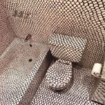
It’s actually very difficult to look at this picture for more than a few seconds. Already, a few seconds are enough to give us a hell of a headache!
What was the purpose here, drawing with a Sharpie—we deduce that it’s done by hand since it’s very uneven—something looking like fish scales EVERYWHERE? It’s a good thing the toilet paper roll didn’t go through it too!
2 Old Chevrolet

You know those cute little race car shaped beds for kids? It’s cute, and any little boy dreams of having that kind of bed.
Clearly, this man has never had one, and it affects him greatly. So he decided to create his own adult bed out of a rusty old Chevy pickup truck. If we were him, we’d be careful not to catch tetanus during the night!
3 Welcome To The Fair
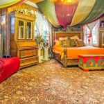
We would never be able to sleep in this room. There are way too many things to see, it’s not a relaxing place at all!
The decoration makes us think of a fair. We can expect the arrival of a bearded woman or a fortune teller at any time.
4 Wild House

We have already seen, and often, houses with a deer or moose’s head as a hunting trophy, among others. Nothing out of the ordinary for a hunter. This particular hunter, however, may have gone a little overboard on the trophy hunts.
Is this person a safari enthusiast? Did they hunt all these animals themself? This room is like a natural history museum!
5 I’m Seeing Red
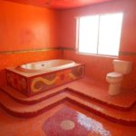
We are really trying to understand what went through this person’s mind when tiling their entire bathroom with these red tiles.
Do they just really love the color red? How do they get out of the bathtub without slipping on the steps?
6 In Love With The Pattern
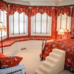
When you love a design, you want to see it everywhere, right? Well, this person stopped at nothing and covered her room with this orange floral pattern.
Everything is the same, whether it’s the bed, the walls, the benches on the windowsill, the curtains or the cushions on the sofa.
7 After Dinner And A Show

Who doesn’t love dinner and a show? Some people pay big bucks for those kinds of things.
But with this bathroom, you get an after-dinner show. Do your business with the soothing sounds of classical music played live right next to you!
8 Stoned Out
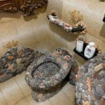
Some people love nature so much that they have to have it with them everywhere. Including their bathroom.
But more specifically, the rocks in nature. Want to sit on a bumpy toilet seat that’s hard to clean? This is the bathroom for you!
9 That’s Too Much
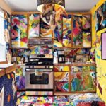
This kitchen makes us feel dizzy. And it gives us a slight desire to throw up. What kind of person can live in such a setting?
It is too much! Everything is too much! Why did they have to cover the cabinets, the walls, and the floor? And to add curtains and a light fixture as colorful as the rest?
10 Blue Queen
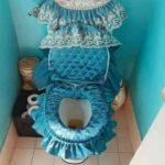
There’s nothing too good for the queen of the house. There’s no way she’s going to relieve her bladder or bowels anywhere but on a respectable throne.
Not only is this blue frilly upholstery extremely ugly, but there’s no way it’s hygienic. We would never want to sit on this toilet.
11 Just One More
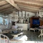
“Please, my love, just one more.” “But we already have enough chandeliers!” “But one more, just to make it really really full… pleaaaaase!”
NO! It’s hard enough to count how many chandeliers are in this room because there are so many. Sometimes, moderation is so much better.
12 Under The Sea

There’s nothing quite as relaxing as watching animals in their natural habitat. You get to see them actually interacting with other animals.
Plan your next getaway to this relaxing room! You will get to experience animals doing what you’ve never seen before!
13 The Box
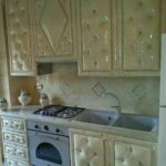
Cabinets are dangerous. The hard surfaces and sharp corners are just an accident waiting to happen.
Don’t worry! You can just pad your kitchen like rooms in a psychiatric hospital! Plus, an added bonus is that it will be soundproof!
14 The Throne
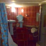
Who doesn’t want to sit on the throne while sitting on a throne? With this setup, you’re basically royalty.
It’s time to live out your dreams of ruling a kingdom! Plus, you can close the curtain when you’re tired of looking at peasants all day.
15 Old School
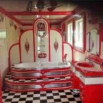
Let’s go back in time to diners, carhops, and jukeboxes. The ’50s really were an iconic era.
So iconic that this person wanted to recreate their favorite parts of it. Who doesn’t want a ’50s themed bathroom?
16 Not Too Much
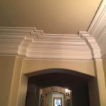
Crown molding definitely has a reputation of being overdone sometimes. But not here.
We think this molding is just perfect. The way it looks like it’s just stacked on top of each other, and basically goes halfway down the wall, it’s stunning.
17 The Fun House
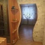
Don’t be fooled, this isn’t your average funhouse mirror. It actually isn’t a mirror at all!
This door will play tricks on you, making you think that you’re seeing things. It’s a never-ending game.
18 Showers For Everyone
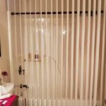
In this bathroom… You get a shower! And you get a shower! And you! Everyone gets a shower!
This shower curtain is strategically placed so that anyone who goes in can join in on the fun.
19 Paint By Numbers
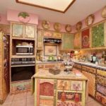
Are you tired of your children drawing on the walls? Do you want them to do something more productive with their time?
Just find some paint by numbers kits and decorate your kitchen with them! Your kids will love it!
20 Privacy Please
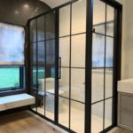
Have you ever met someone who was not shy about anything? They are constantly telling you every detail of their lives, whether you asked for it or not.
This bathroom is exactly what that over-sharing person would have in their home. They don’t care, they put everything out in the open anyway.
21 The ’70s Are Back
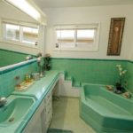
Remember in the ’70s when everything was decorated with the most awful colors? This bathroom has brought back that awful detail of that decade. It looks like mint green just threw up everywhere.
Oh, and you can’t forget about making a proper bathtub entrance with the tiled stairs off of the counter. Who doesn’t want their relaxing night turned into an emergency room visit?
22 Chevron Love
When you really love something, you try to incorporate it into everything that you can.
The walls, the floors, the bed… Nothing will be left out.
23 Yellow Rococo
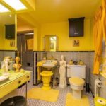
Looking at this picture makes our eyes and head hurt. There is too much to take in, and most importantly, it is way too yellow!
Was it necessary to paint the top of the walls yellow, put up yellow curtains, and then accessorize the room with almost only yellow objects? And are so many objects essential in a bathroom?
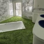
24 Indoor Garden
Who doesn’t love getting out of the bath feeling clean? And who doesn’t love the feel of grass between their toes?
Well, not actual grass. Just an extremely horrendous green carpet that very closely resembles grass. The perfect addition to any bathroom!
25 Mermaid Dreams

At one point or another, every little girl dreams about becoming a mermaid. I mean, they are literally obsessed with the idea.
Why not try to help your child’s dreams come true? You can just create a real-life mural so they feel like they are living out their mermaid dreams!
26 What’s On The Counter
Imagine having to explain to everyone who comes over that no, that is not poop smeared all over the counter. That is just the design.
Yes, we know it looks like poop, but I promise it’s not. It’s completely sanitary!
27 Danger Zone
What’s better than waking up in a hurry and accidentally poking yourself in the face with your wall decor? Nothing!
That’s what this person thought when they put this over their bed, obviously.
28 Are You Blind?
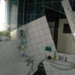
Sometimes you have to work with what you have. Even if it doesn’t look the best.
Which is exactly what happened here, or what we’d like to think happened. Because who would intentionally make their tiles look this disorganized?
29 Mirror, Mirror
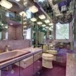
Want to use the restroom looking at every inch of your body in extremely awkward positions? This is the bathroom for you!
We know that everyone has a mirror in their bathroom, but this is a little too much.
30 The DIY Of Your Nightmares

When you have a project that needs to be done, you just do it yourself!
If the tiles don’t match the color of the countertop, just color them in! Who cares if they don’t match exactly, at least it’s done.
31 Peek-A-Boo
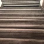
Are you trying to make life a little bit more entertaining? Just install striped carpet to hide your stairs and life will get a whole lot better!
If you want to make things more interesting, don’t tell anyone there are stairs there and let them find out on their own!
32 Be Careful
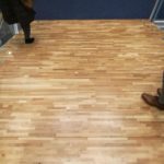
At the first look, this floor just looks like there was hardwood installed. But if you look closer, you can see the hardwood is actually on top of a flight of stairs.
Not only can hardwood be slick, but with the added surprise of stairs, it’s just a disaster waiting to happen!
33 Bathroom Brown As…

This bathroom makes us feel somewhat uncomfortable. Whose idea was it to cover the walls and ceiling with brown carpet?
We feel like we’re in a cave lined with what should only be in the toilet…
34 Eclectic Bathroom
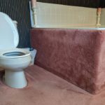
Pink carpeting that runs up the sides of the bath, a lined black wall, cream-colored tile and two vintage chandeliers.
That’s a lot to take in at once! Not the most relaxing room to take a bath, let’s say it like that.
35 Just No
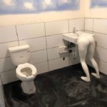
We know it’s important to wash our hands after using the bathroom, but we could NEVER wash our hands at that sink. Just no.
This is one of the creepiest things we’ve ever had the chance to see. Who came up with this ridiculous and very tasteless idea?
36 Frilly Shark
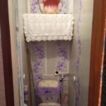
Quickly, it looks like the bathroom of a 4-year-old girl who loves the color purple and frills too much.
When we notice the—purple!—shark’s head sticking out of the wall above the toilet, however, we’re not sure of anything anymore. But what is this?
37 Magic Cards Floor
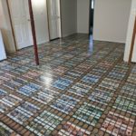
Ok, let’s be honest: at first glance, this floor is kind of cool, even if the colors are a little strange for a floor. The pattern is still interesting!
When you take a closer look, however, and notice that the pattern is created with hundreds of Magic cards, you start to judge the person who created it a bit.
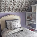
38 Modern Sistine Chapel
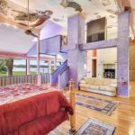
Our first impression of this room is that the purple walls, the bottom of the walls covered with a lined tapestry and the pink top of the walls do not work well together.
And then, we look at the ceiling of this room and we wonder if a child has not had carte blanche to reproduce in his way the ceiling of the Sistine Chapel. Everything in there is ugly.
39 Uncomfortable Design

We couldn’t really say why, but this room makes us very uncomfortable. We couldn’t stay there.
Maybe it’s because of the two strange pink legs that support the counter, or maybe it’s because of the strange relief on the ceiling on the side of the stairs.
40 Cat House
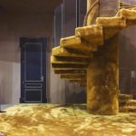
Either the person who lives there owns dozens of cats, or it is a close-up of a small cat house. In any case, cats must be involved here.
There is no reason why a person would have decided to cover the floor and stairs of their house with this type of carpet if not to please the cats, right? We can’t believe they could actually like it.
41 Butterflies Lover
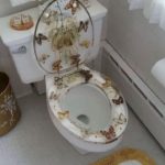
Who doesn’t like butterflies? They are generally beautiful, and they are potentially the least obnoxious insects there are!
However, we like them in the wild, not on our toilet seat. We’d be a little uncomfortable sitting on that toilet.
42 Creative Stairs
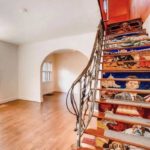
This is not the first time we have seen a staircase painted in this way. In general, it is a fresco a little more sober, representing books, for example, or words.
The owners of this house, however, went for something much more colorful and eclectic. We are not convinced by their choice.
43 Medieval Kitchen
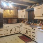
The person who renovated their kitchen in this way is either a history teacher specializing in the Middle Ages or a geek who is a fan of live action role-playing games.
If at least the hinges had been put straight on the cabinet doors and the accessories didn’t look so cheap… but no, besides being ugly, it’s badly done.
44 Too Handy
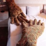
Oh, no! No one is going to convince us to sleep in a bed with two big hand-shaped pillows. It’s way too weird!
There’s something creepy and uncomfortable about these pillows. Whose idea was this? Does anyone really sleep with two big hands next to them?
45 Veggie Kitchen
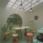
There are people who like to eat vegetables, people who just like vegetables, and there are those people who live only for vegetables. To the point of making it the theme of their kitchen.
This kitchen is like eating from a big salad, humans being like the protein that completes it. Ugh, creepy. For a children’s playroom, it would be acceptable. For a kitchen, it’s not.
46 Satan Mouth
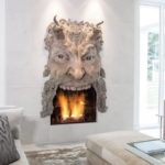
Indoor fireplaces are the most pleasant and warmest thing in a room.
Except when they are topped with a big, ugly stone Satan head. It’s creepy as hell!
47 Start Off On The Right Foot

If you want someone to injure themselves going up, or more importantly, down your stairs, these are the perfect steps for you.
Make sure you start your ascent or descent on the right foot, because it could be brutal.
48 Jackson Pollock Or Dexter?
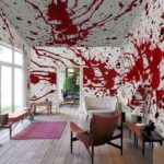
If you like the drip style, maybe it would be better to put paintings on your wall rather than turning your room into a gigantic Jackson Pollock work of art.
At least, it would be better to avoid red paint, because it makes you wonder if Dexter has recently been there.
49 Scientist Bathroom

If you hang out with a scientist, you may come across a bathroom with a periodic table recreated on the tiles of their bathroom shower.
We don’t really see who else would want to do that. It would seem easier to us to buy a shower curtain with a periodic table on it, but anyway.
50 Glass Castle
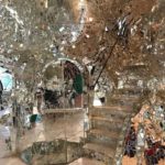
This room has the potential to give you a headache, and to probably injure you as well. Who thought this was a good idea?
If only it were big mirrors, but no, it’s a ton of little pieces stuck together. Clearly, there’s a way to cut yourself somewhere.
51 Inside An Orange
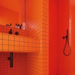
We found the perfect bathroom for orange lovers. It’s so orange, you’d think you were literally IN an orange!
This bathroom is really very orange. We’d be curious to know if the part we can’t see is just as orange, and if it only has accessories of the same color!
52 Futuristic Retro Vibe
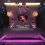
When we look at this room, we have both a futuristic and retro vibe. We really have a hard time defining this style.
The lighting and overall look makes us feel like we’re in a sci-fi movie, but the very rounded shapes remind us a lot of the 1970s.
53 Open Space Rococo
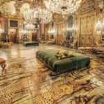
If you want to relive the Rococo era and sleep in an overly decorated room, this place is for you!
But don’t look for too much privacy, because this is a double room with two large beds. You can’t have everything, you know!
54 Draped Toilet
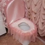
This is the cheapest fancy bathroom we’ve had the chance to see. What’s with those draped shower curtains and that toilet covered with a pink fabric full of frills and lace?
We sincerely believe that we would have a hard time using this toilet. It’s just too much and ugly.
55 Real-Life Doll House
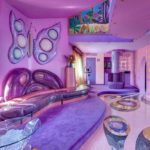
Clearly, this is a close-up of a dollhouse, right? All that purple, that big butterfly on the wall and whatnot, nobody could really live in that, could they?
The owners of this place definitely thought the decorations with an 8 year old girl in mind. We can’t think of any other explanation. And let’s mention the presence of the stationary bike, which is very unusual in the decor!
56 Girly Wildness
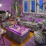
This is what happens when a very girly woman wants to go on a safari, but is not much into outdoor activities.
This piece is very purple and zebra. A little too much, even. And did anyone tell her that foam floor tiles are meant to be used on the floor and not as a coffee table covering?
57 Glassy Nature
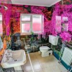
We don’t know what we find most dairy in this Irish bathroom. The wallpaper made of rocks and trees or the fact that the whole room seems to be covered with glass?
All the glass makes the room really shiny and strange. And imagine how much it must need daily cleaning! Also note that the toilet paper roll is directly on the floor… so much for hygiene!
58 Dentist Waiting Room
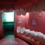
This waiting room of a dentist is original, to say the least. If you weren’t sure you were in the right place, this decor will certainly confirm it.
But is it necessary? We would be somewhat uncomfortable waiting for our appointment in this room. And it’s a good thing it’s just a dentist! Imagine such a waiting room at the gynecologist…
59 Under The Sea

A mosaic of the ocean floor with fish, dolphins, turtles and others, it is ideal to decorate the walls of an indoor pool, right?
If it was better done, maybe, but this is quite ugly. It’s more disturbing than anything else. Just a nice, minimalist decor could have worked just as well.
60 Bathroom Drawing
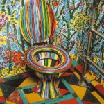
It looks like this bathroom was left to the mercy and creativity of a bunch of kids. It’s too much everything. Too many designs, too many patterns, too many colors, and everywhere.
Even the inside of the toilet bowl is colorful! We don’t recommend going to this bathroom if you’ve had one too many drinks; it might make you sick!
61 Black And White
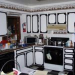
Did the owners of this home want to match the colors of their kitchen cabinets to their oven? Because they did.
And while a mix of black and white is passable for an oven, for cabinets, it’s awful. It gives a harsh, serious feeling, don’t you think? This kitchen is not at all welcoming.
62 Never Run Out Of Toilet Paper Again

There’s nothing more unpleasant than realizing after you’ve done your job that there’s no toilet paper left, is there?
Well, there’s no way that can happen to you in this bathroom! One big pack of toilet paper from Costco isn’t even enough to fill the whole thing.
63 Aladdin’s Bedroom
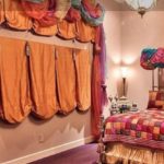
We could see this bedroom in an Aladdin movie. All these multicolored draperies, it’s very gypsy.
We don’t understand the huge drapes on the wall, though, which don’t even seem to hide a window. They are so big that next to them, the bed seems tiny!
64 Just Like The Outdoor
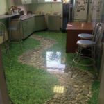
A work day can sometimes be long, and especially on beautiful summer days, it can be demoralizing to stay inside.
But this office has found the remedy to its employees’ gloom. Who needs to go outside when the kitchenette looks like this? It’s just like the outdoor!
65 Halloween All Year Round
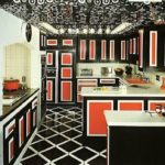
We have no other explanation for the look of this kitchen than that it belongs to devotees of Halloween. All that black and orange mix, it can only be that.
Really, this kitchen is dark and not at all inviting. Even the floor and ceiling are mostly black! And the small elctromagnet on the left counter and the sink are orange. We couldn’t cook in this kitchen. Let’s go to the restaurant!
66 So Much Love

Who doesn’t have pictures on their refrigerator? Couple pictures, family, children, friends, everything is possible! But this couple is next level.
Why put only a small standard size photo when you can literally line your fridge with it? Their love is much bigger than a 4 x 6.
67 The Lion King Throne
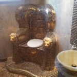
It doesn’t get more pretentious than this throne-like toilet. And not just any kind of throne, eh, the full one, made of golden tiles with lions’ heads at the end of the armrests.
Someone wanted to relieve themselves in lust, and this is what they came up with. We’re not sure if “luxurious” is the right word for this toilet, though.
68 Adult Ceiling
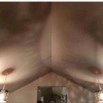
Clearly, the person who put these fixtures in didn’t think of everything before they put them in, otherwise they wouldn’t have put them in like this, or they would have chosen different fixtures. Recessed, maybe?
If not, the person got weird tastes and it was totally intentional, but then we would be dealing with a different problem. Still, we would love to see the guests’ faces when they turn on the lights!
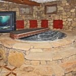
69 The “It Looks Like It’s Outside” Indoor Spa
Maybe it’s a bath, because in the end, it’s inside, but the setup and shape remind us more of a spa. In any case, why such a design?
Who thought it would be nice to bring in very large slabs of stone to create a very unsuccessful outdoor effect? It’s ugly and tasteless. No one will feel like they are in the forest or something.
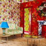
70 Too Flowery
Floral patterns are generally pretty, but it’s best to go with moderation. Different floral patterns are like different patterns of any kind, they don’t necessarily go well together.
The decor in this living room is anything but relaxing. Just one of these patterns, and in small quantities, would have been enough. Here, it’s too much.
71 Indoor Outhouse
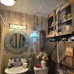
Rustic style has been back in vogue for many years, but looking at this bathroom, it makes you wonder at what point the rustic threshold is crossed and just becomes run-down.
When your bathroom looks more like an indoor outhouse, it’s a sign, in our opinion. It looks like an outhouse that is trying in vain to be somewhat clean and chic. It’s just sad.
72 Meat Curtain
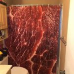
When you hear the term “meat curtains”, it’s not usually the image that comes to mind, but here, you literally have a meat curtain.
Well, not really literally, because it’s not real meat, but still. This shower curtain reminds us of a certain controversial dress that Lady Gaga wore several years ago.
73 Too Much To Process
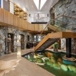
It’s very hard to get an idea of what kind of place this might be. Is it a house? A hotel? An office? Whatever it is, the interior designer seems to have had a hard time choosing only one style for the decoration.
Between modern, medieval, Asian, Indian and rustic, it is difficult to assimilate everything in this picture. This place leaves us completely confused.
74 Judgmental Urinals

There is no need to say, a man must be very comfortable with the size of his member to pee in these urinals.
If not, he better choose his urinal strategically, because these ladies seem to be very hard to please!
75 Hillbilly Bathroom

It seems that the owners of this house spent their entire budget on the faucets and shower, and then had to take what they had on hand to make the bath.
You only hear about this kind of tub being used for bathing in pretty old stories, or in a horror movie where people aren’t treated well, let’s put it that way. If we were you, we wouldn’t wash in it.
76 Another Kind Of Office Vibe

When someone asks you to create a nice relaxing space in the office lobby, that’s potentially not quite what they were referring to. We have nothing against 69s, but in the office? It gives a different vibe, let’s say.
According to one Instagram user, this lobby can be found in the Netherlands, and they claim that the Dutch are “not scared of sexual references.” You can see that, indeed.
77 Bagel Lover
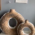
If you love bagels and could eat them morning, noon and night every day, these vases are definitely for you. The cream cheese is even included! These vases are perfect for placing old branches in to create a rustic look, right?
But if we put those ugly vases aside for a few seconds, it would be important to mention the light switches on the wall right above them, that couldn’t be installed more crooked.
78 Chocolate Mint Bathroom
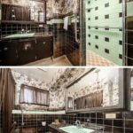
There’s nothing better than mixing chocolate and mint, whether it’s for ice cream, hot chocolate or just a piece of chocolate.
But as far as mixing their color to decorate a bathroom, it’s a no go. A poop colored bathroom with lots of mint green elements just doesn’t feel right.
79 Vintage Barbie Room
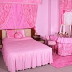
If we had to imagine what Barbie’s room would have looked like in the 70s, this is exactly the image that would have come to mind.
The dedication of this person to accessorize the room with only pink stuff is amazing. Even the floor itself looks it’s of a shade of pink with all this pink around!
80 Pooping With The Fish

Have you always dreamed of going to the bathroom surrounded by fish? If so, just go to Hipopo Papa Cafe, in Akashi on the Hayashizaki Matsue Coast, Japan.
It must be strange to poop in the middle of an aquarium, right? Let’s hope there is only one bathroom like this, otherwise you could easily see the person in the bathroom next to you!
81 Hello Kitt…ies
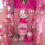
We don’t really believe it, but inwardly, we’re very hopeful that this small bathroom is the one adjacent to a child’s room.
We can’t imagine an adult decorating their bathroom like this. They like Hello Kitty? That’s their business, but this is many, many kitties.
82 Psychedelic Living Room
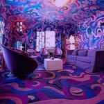
This piece is so intense. There’s no way you can relax in a place that looks like this. It’s dark, cluttered, and clearly smells bad.
This psychedelic room, however, seems like the perfect place for a fun and high night out with friends, if you know what we mean.
83 Sun And Flowers
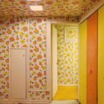
There is no need to say, this decoration reminds us of spring! This floral wallpaper that covers all the walls and ceiling is very yellow and orange.
And that’s not even counting the yellow carpet and the yellow and orange closet doors! Whether you like it or not, you can’t deny that it’s very bright and cheerful.
84 Magic Steps
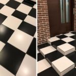
Mind games can help improve your cognitive function. So why not incorporate them into your house?
What could go wrong? You trip and fall and break something? Seems like a small risk to take.
85 Rapunzel, Rapunzel
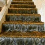
Rapunzel, Rapunzel! Let down your hair! When you see these stairs, the only explanation would be that Rapunzel herself was standing at the top of them.
Except she isn’t, and it’s just a staircase covered in hair. Do they brush it? Do they shampoo and condition it? So many questions.
86 The Softest Bathroom

Bathroom surfaces are just way too hard. We understand why they’re made that way, but couldn’t they just be a little softer?
Be careful what you wish for, or you could end up with this nightmare of a bathroom. How do they clean it? If there’s an accident, does the carpet even dry?
87 Can You Get The Time
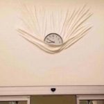
Trying to figure out where to place a nail when hanging up a clock is just way too difficult. So, they made it easy.
With this design, you can just set the clock inside of the warped wallpaper and never have to worry about finding your hammer and nails ever again!
88 Cozy Vibes
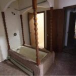
There is nothing that carpet cleaners love more than trying to get stains out of your carpets. Except when they get to clean the carpets around your bathtub… That’s what they really love.
The carpet surrounding the bathtub and the wooden columns make it look quite interesting, to say the least.
89 Groovy Business
This bathroom is perfect for anyone who wants to have a mind-altering experience. There is so much going on here.
Plus, your “business” gets to have that same experience!
90 Master Bedroom From Another Era
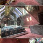
We are without words in front of this ignoble master bedroom. Apparently, the rest of the house is very normal, but the owners have definitely let themselves go wild in this room.
Between the excessive amount of mirrors, the pink carpet, the flowery bed, and the black furnishes in the bathroom, we can’t decide which is worse.
91 Tasteless Arts
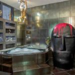
The bathroom itself is decorated out of the ordinary, but despite the metallic-style tiles, if it were just that, it would be acceptable.
But what’s up with that gold monkey statue hanging from the light fixture and that big black head with a dripping pink paint stain on top? That’s not art, that’s a disgrace.
92 Pretty In Pink
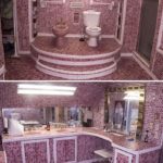
Do you like pink? But, like, really? Because the person who lives there likes pink a LOT. A little too much, even.
This person loves pink so much that not only does she have a pink toilet and sinks, but she thought it would be a good idea to cover her entire bathroom, from floor to ceiling, with small ceramic tiles in different shades of pink and purple.
93 Fanatic

We are not going to lie, this room gives us goosebumps. The bed and the curtains, with their torn and patched look, do not give us confidence.
But that’s without mentioning the very large number of crosses on the wall. This room can only belong to an extreme fanatic, with this amount of crosses, right?
94 Pandaland

Although pandas are rather aggressive animals, they still are the cutest, and this person definitely agrees with us.
From pillows to blankets to stuffed animals, picture frames and even the tables, there’s no doubt about this person’s love for pandas.
95 All The Kisses
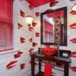
This bathroom is very original. We don’t know what we like less: the sink, the red ceiling, the red blinds or the wallpaper?
The lip-filled wallpaper is potentially the worst. There’s a difference between liking red too much and surrounding yourself with women’s lips.
96 Barbie’s Kitchen
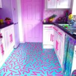
This kitchen literally came straight out of Barbie’s Dream House. It really is the kitchen of your dreams!
Except it’s not actually a dream, it’s a nightmare. And you ended up here in Barbie’s kitchen.
97 Welcome In The Universe
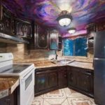
Everything in this room puts us off. First of all, the floor tiles are a little too fancy for us. And what can we say about the old-fashioned and dark cabinets? Not to mention the countertop, which is not so nice either.
But the cherry on top is definitely the ceiling, painted to look like a close-up of the universe or something like that. Honestly, it makes us feel sick.
98 Straight Out Of Game Of Thrones
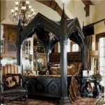
This room seems to come straight out of medieval times. We could easily see it appear in Game of Thrones!
Still, this room is very intimidating. We would not be too comfortable to spend the night there.
99 Pastel Disco
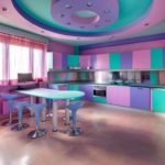
We have a hard time deciding if we find this kitchen original and cool or too much and ugly. We would see these colors more in a kid’s room, maybe.
Nevertheless, the idea is interesting. Don’t you think there’s a sort of disco vibe emanating from this decor?
100 Nauseating Opulence
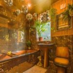
If you thought opulence was synonymous with good taste, think again. This bathroom puts us off on many levels. First of all, what is this toilet, sink and bath design? It looks like an old set of dishes from our great-great-grandparents.
As for the rest, the little golden mirror tiles make it all too shiny, and the ceramic tiles on the floor and wall make the room too busy. And what about the disco balls on the ceiling? That’s horrible.
